
Husky Robotics Team Redesigns
For the 2016-2017 Husky Robotics Season, I designed their Graphic User Interface (GUI). The previous GUI had been difficult to understand or use and the team wanted to have a better one for their next season. I also built and designed their new website. The old website was outdated, difficult to edit, hard to share, and didn't support all the functions the team needed. I agreed to design and build a new website for the team specifically for the 2017 team, but one that would be usable for years to come.

Illustrator Draft
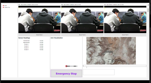
Final GUI
GUI
Building a GUI
To start with, I did some background research. In order to build the best GUI, I had to understand what the situation was and what would be needed on the final product. I began by asking the team leads and members a series of questions: What is the GUI for? What do you want the GUI to include and/or be like? What problems did you have with the previous GUI? I learned that the GUI is for the people who will be driving the robot remotely at competition, and that the main issue was that it was very hard to read, understand or use. I made a list of what needed to be included:
Necessary: Three Cameras, Map with GPS, Emergency Stop
Possible: Arm position visualization, Sensor readings, health readings of camera and sensors
In order to get a better idea of how to build the design, I looked up other activities that involve reading multiple sensors and cameras at once; flight simulators, other rover GUI's, and video game interface design. I used this to come up with a series of design drafts in Adobe Illustrator.
Once I had multiple drafts, I asked multiple team members to help evaluate the different drafts, and used their feedback to design a final prototype. Using that prototype as a framework, I worked with the software team to build a GUI using PyQT, that the team was able to use at competition.
During this process, we had to make various changes. For example, the emergency stop was supposed to be red, but was found to be too distracting, so we switched to purple. There were also significant technological challenges as we incorporated myriad ideas (the arm visualization) into the overall GUI. However, the final GUI was incredibly user friendly and worked wonderfully.


WEBSITE
Building The Husky Robotics Team Website
Process:
Easy to Read/Looks Professional:
I chose simple colors and shades that are thematically appropriate and arranged letters in a large and clear sans-serif font. The logo is in black and white, so I used them as base colors throughout the website because it is easy to read, provides great contrast, and works with all other colors. Since the official color of the University of Washington is purple (and the team shirts are purple as well), I used shades of purple as an overlay for the page pictures as well as for subheadings and borders. The white lettering contrasted with the purple to be easy to read.
Easy to Edit/Supports pictures and sponsor information:
The website is built on Squarespace, so anyone authorized by the team to edit the website can easily add pictures or change content. Squarespace functionality involves a variety of galleries that made arranging and showing the pictures much easier. The Sponsor Information is available in both the scrolling and on an individual page.
Conveys Basic Team Information/Contact Information:
The website is one main page that the user can scroll down and gather a fairly accurate picture of the team, and more information can be found under the individual pages in the menu header. All information is written clearly and concisely.