Jill Aneri Shah
Picture1.jpg

How do you solve the opioid epidemic?

In 2018, our team developed a device to help people manage their post operative pain medication.

Working with doctors at Seattle Children’s Hospital over the course of four months, we researched, prototyped, designed, tested, and built an interactive device.

Full Presentation: Process Book

Millions of people are affected each year by the opioid epidemic, and we wanted to help fix it. One of the major issues is that doctors prescribe pain relief medication after surgery but don’t always know how patients are navigating their post-operative pain relief. In order to assist doctors with more knowledge of at-home pain relief and to help patients be more mindful and feel safer taking their medication, myself, Mackenna Lees, Ostin Kurniawan, and Scott Smith decided to tackle this massive issue.

Research

How can we support and improve mindful and data-informed post-operative pain management to maximize patient comfort while deterring medication abuse?

Literature Review - User Interviews - Competitive Analysis - Design Considerations

user flow 04.jpg

The goal of this milestone was to gain a greater understanding of the context of our problem. In designing a product, it’s essential to understand what the specific pain points are in the current system and utilize the gathered information to build a list of design considerations . 

We wanted to hear from real users, so we interviewed ages 20-75 about their experience on pain medication, and talked to a variety of doctors about the problem. This helped us understand what our product needed to focus on for the patient stakeholders - namely, that they took less of the medication than needed because they were afraid of getting addicted while doctors prescribed more just in case of need, so our product should focus on helping patients feel safer and more in control of their medication journey.

We also looked at literature about current medical devices to see what research was done around this topic already, and did a competitive analysis to see what else was out there. While solutions exist for in hospital pain management and long term medication adherence, there was little to nothing for short term pain relief. We used all this information to build our list of design considerations. As project manager, I was in charge of synthesizing the information and ensuring our research was accurate and useful.

Ideation

Now that we know what the users need, how do we make it?

Sketching - Drafting - Modeling - 3D printing

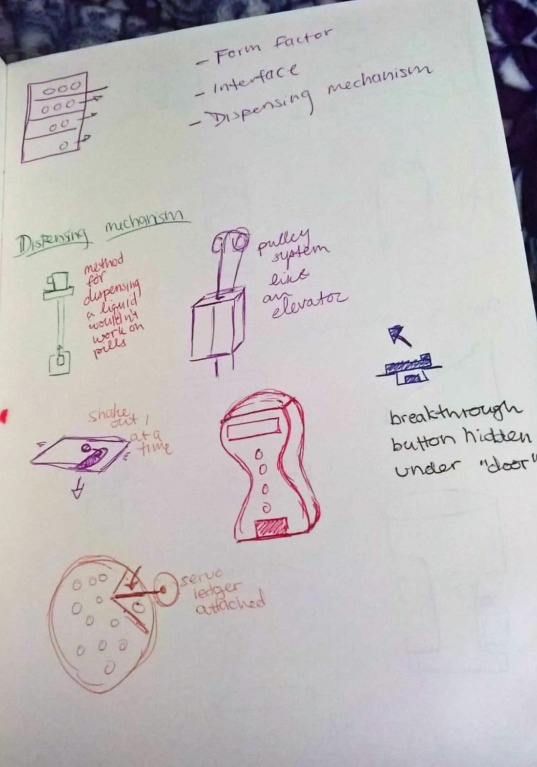
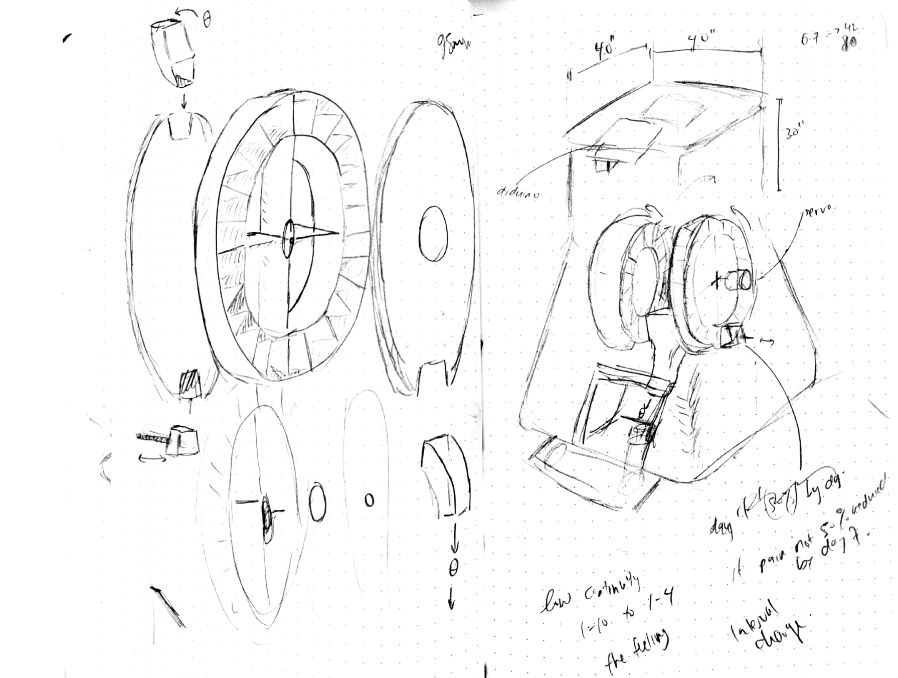
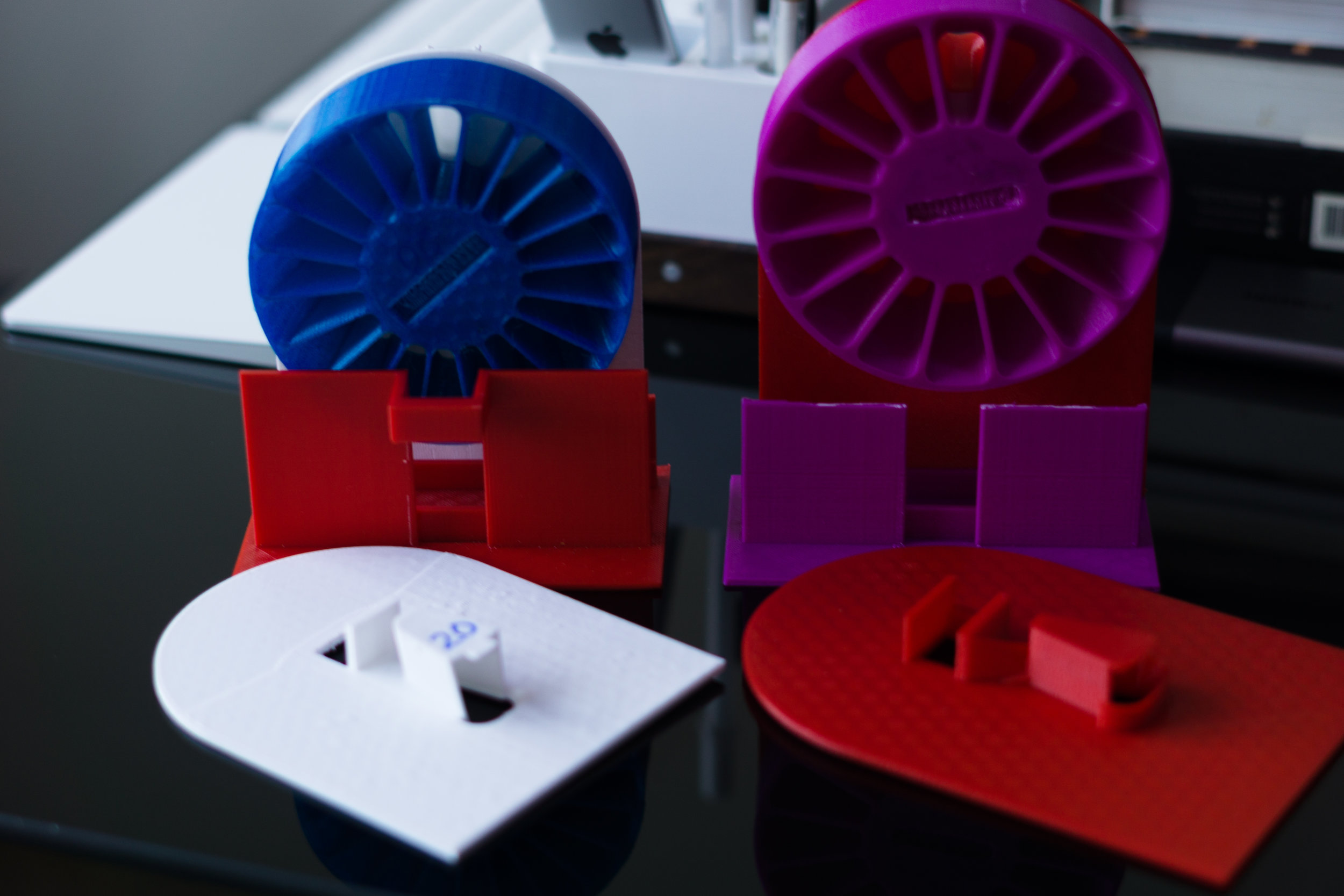
With our list of design considerations, we needed to figure out what we could build. This involved building a user flow, a pill dispenser, an interaction method, and the overall form factor. As a team, we all sketched a variety of shapes and forms we found interesting that could hold the product.

After discussion, our favorites were a cylindrical, cuboid, and ‘apple’ shaped one which we prototyped further. We knew we wanted the pills to come out of the machine, as opposed to the current system of self-regulated pill bottles. This meant we had to devise a dispensing mechanism.

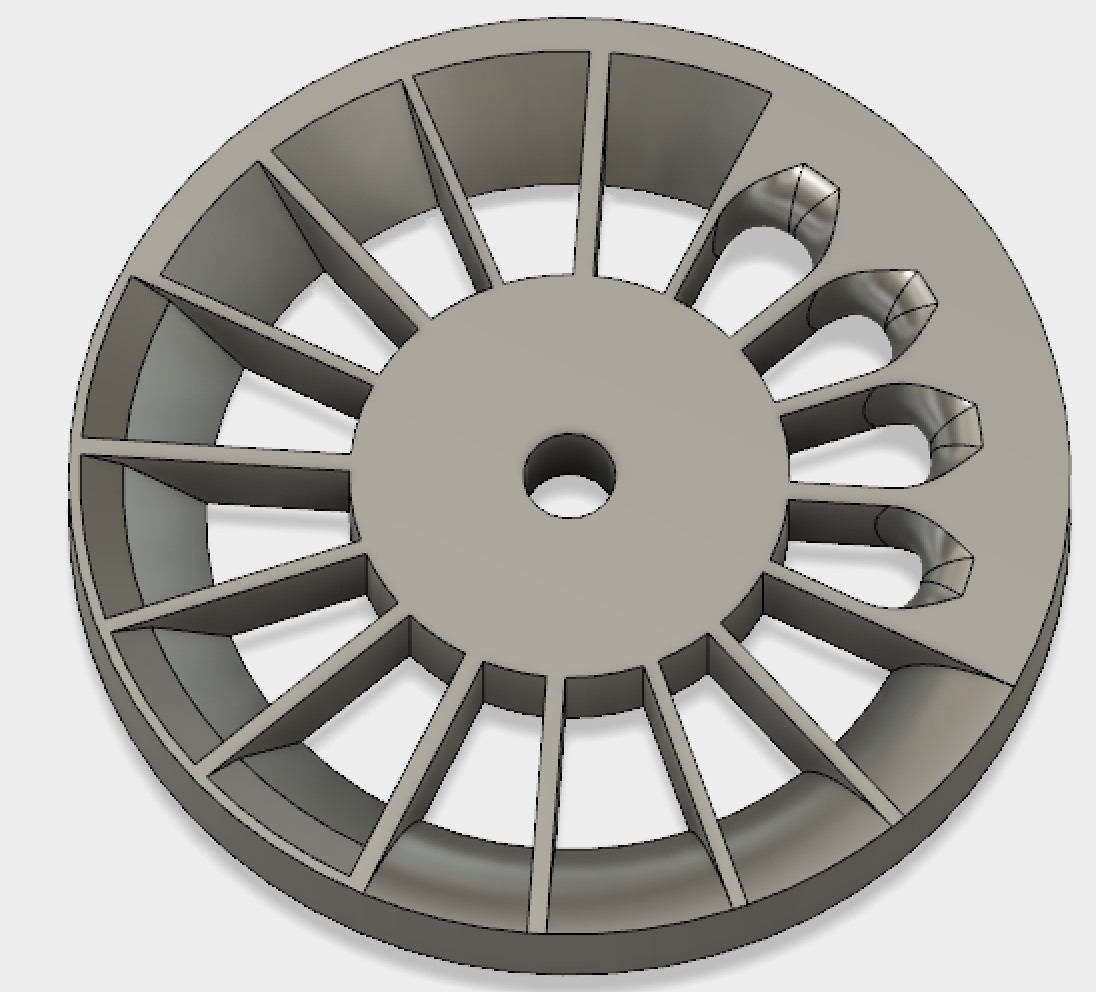
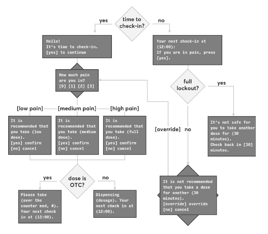
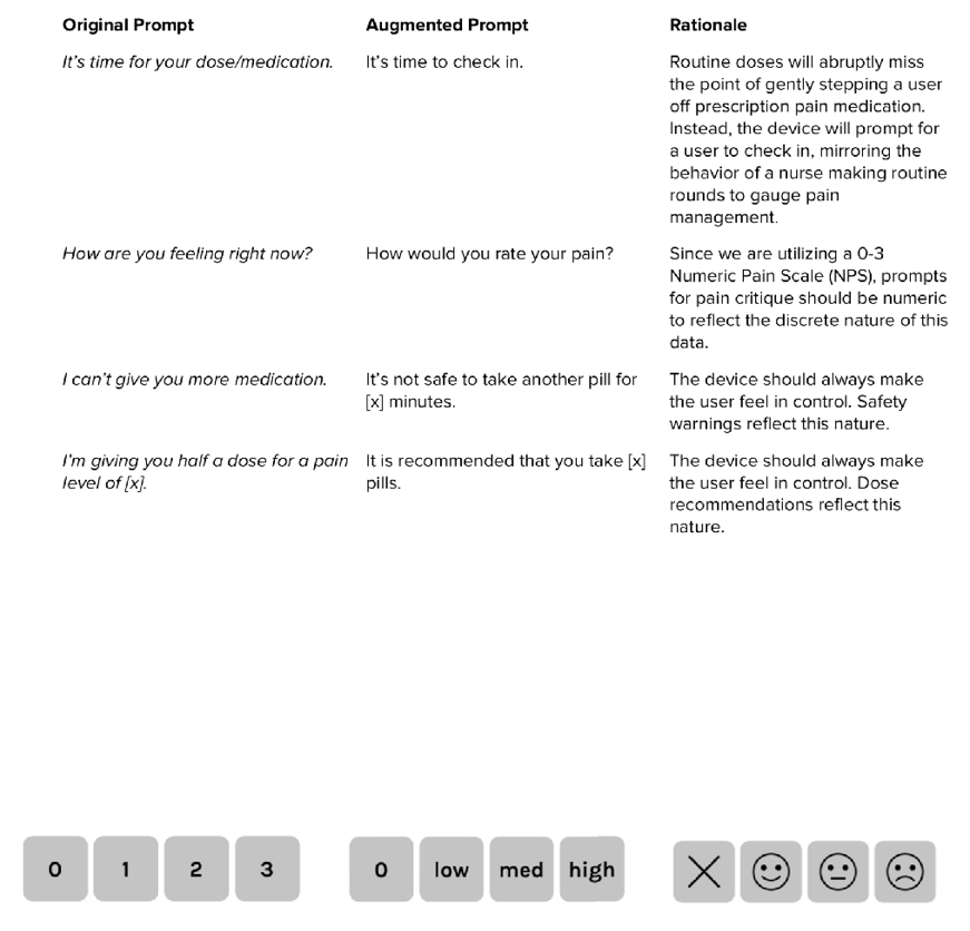
We came up with a variety of ideas, from spirals to slots, and eventually found the simplest and most possible to be an upright wheel. The core of our device was a user flow that would determine how each person would utilize the machine. We simplified the National Pain Scale from 1-10 to a 1, 2, 3 rating level. Based on their pain level, they would be given an appropriate dose . User could override and ask for more medication after a lockout (the time when it was unsafe to take multiple doses)

Iteration

Does It work? What needs to be changed?

Prototyping - Iteration -

Picture4.png

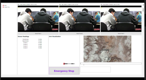
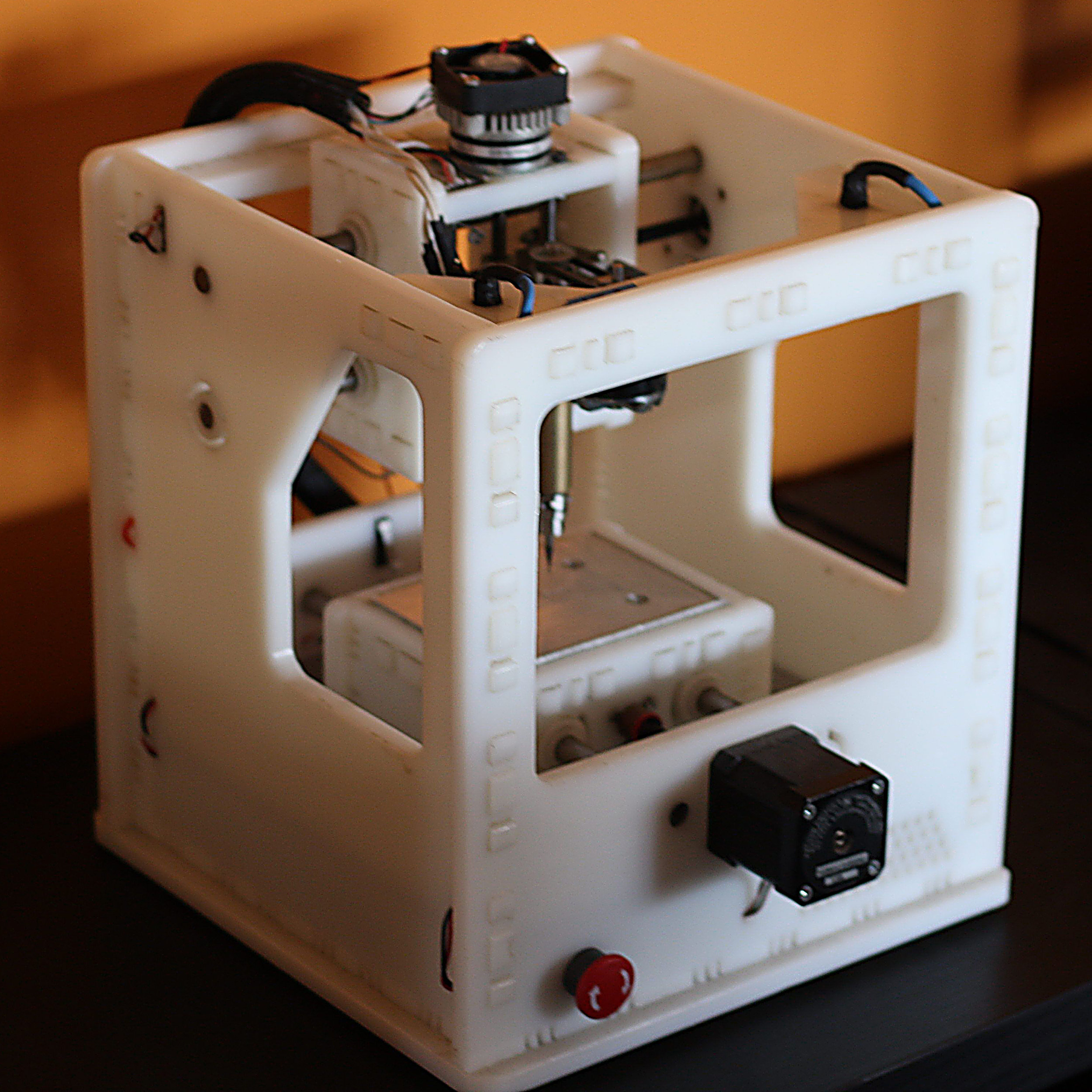
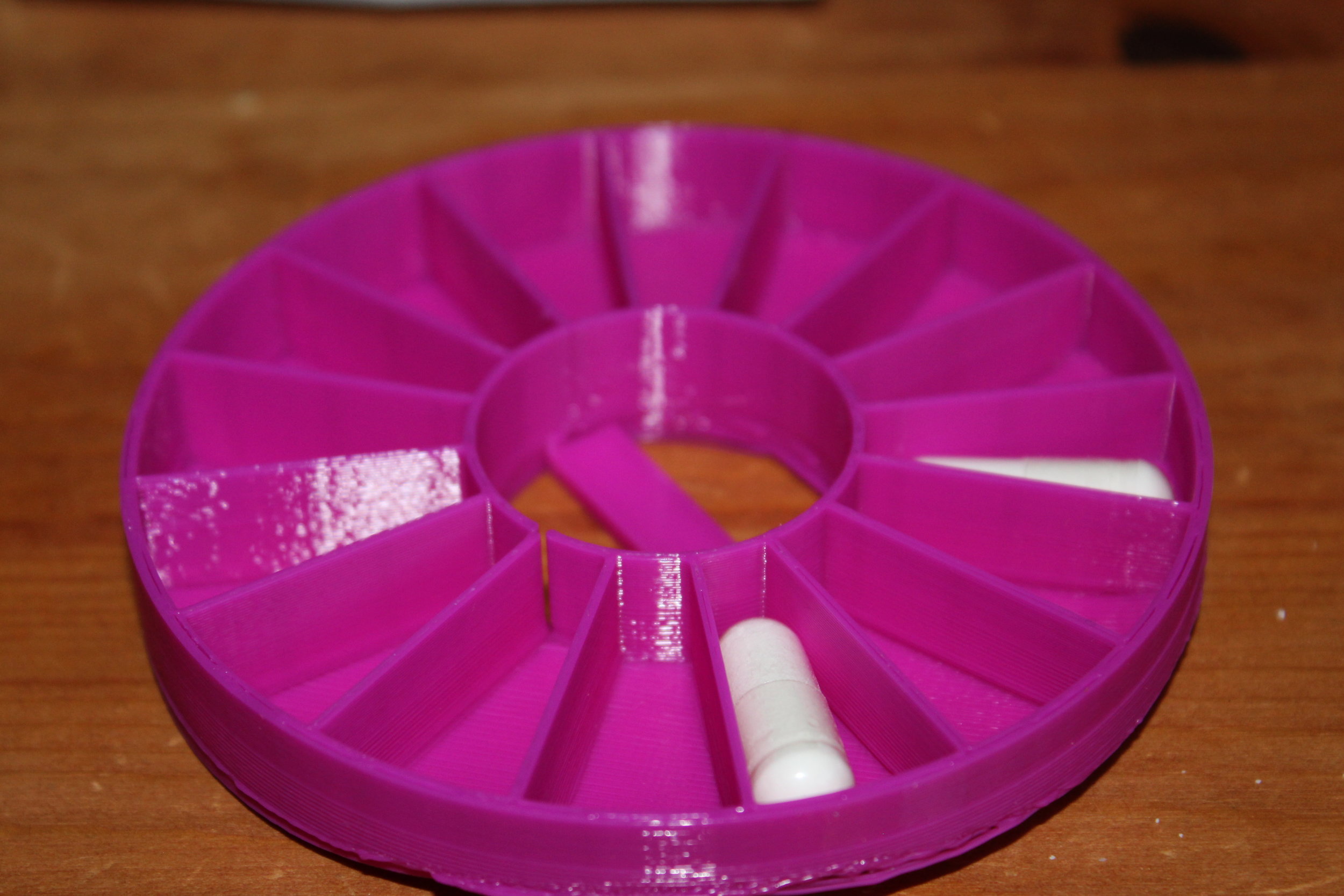
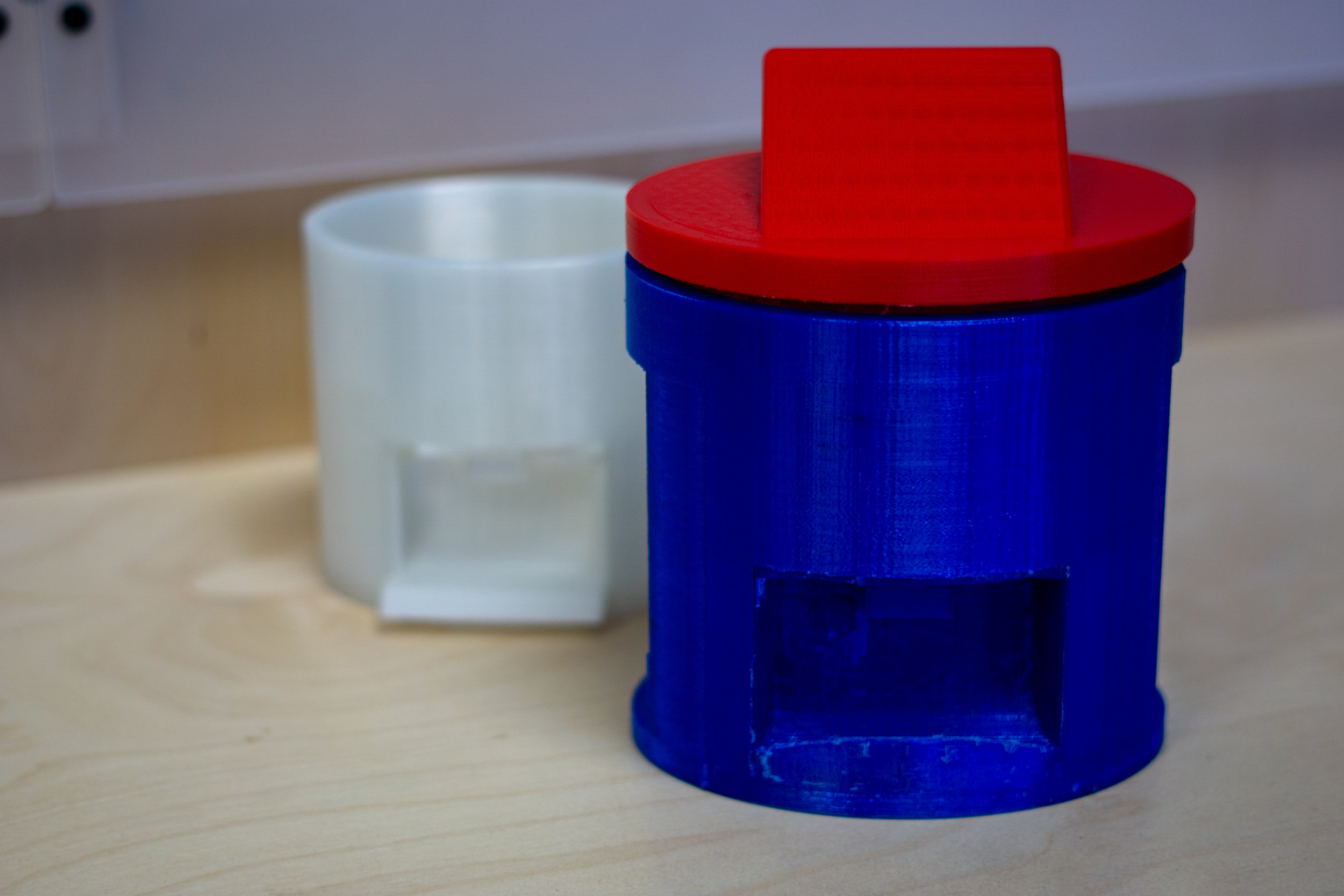
Once we had our initial sketches and ideas, it was time to iterate upon them. I did a lot of the initial 3D modeling and printing of the as we played with varying forms and figuring out what angles and shapes were best. We’d design a part in Fusion, using varying angles and sizes to fit the different pill shapes, print it out, and test it to make sure it would work. However, the dispensing mechanism was not consistent, and our users found the overall form, while easy to access, too dark, blocky, and unfriendly.

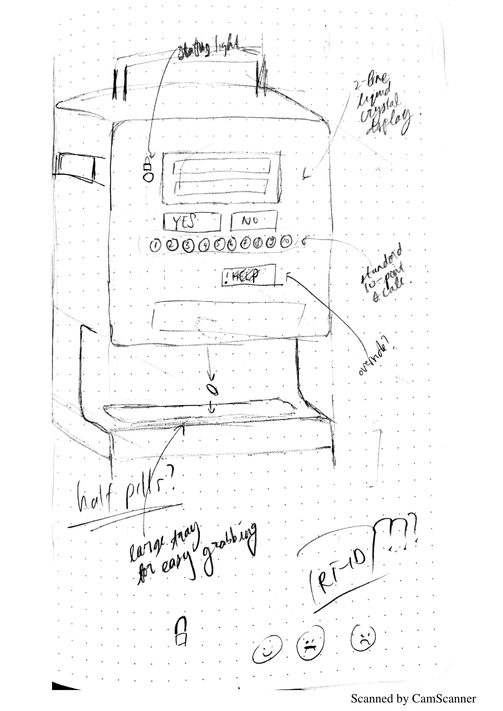
Once we had prototyped a device, we wanted to make sure that it was usable. We asked college students, middle aged, and retired and disabled individuals to interact with the screen prompts and device to understand how they felt about it and how easy interaction was for them. Using this information, we were able to change significant aspects of the design. For example, the original design was very boxy and seen as unfriendly, so we switched to a sleeker white device. We wanted physical buttons, but these confused people, so we switched to a touch screen.

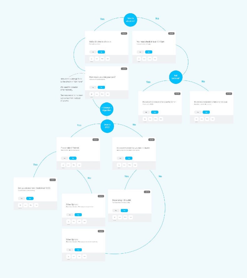
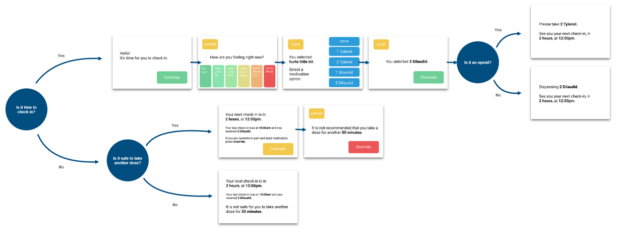
The user flow underwent a variety of changes. The main goals of the interface was that it would be easy to use and extremely clear. Not only would a medical device have to be very easy to understand, people would be using this after surgery when potentially confused or in pain. The goal was to be friendly without swaying the user to make certain choices so they don’t feel ‘manipulated’ by the machine. We experimented with buttons for the pain levels: 0-3, verbal or faces. We initially planned for physical buttons, but user testing (which I took point on recruiting, leading, and analyzing) revealed that the interface was confusing and didn’t involve error recovery for the users. Since we switched from the buttons to a touch screen, we were able to make a more colorful interface that was very easy to use. The pain scale was changed into 6 levels all determined verbally with very simple language for easy reading. The back button was prominent for easy error recovery. The user testing was invaluable and allowed for us to make changes that created a better product.

recap-pca-bs03.jpg

Final Prototype

Final prototype - Presentation - Reflection

This process was both illuminating and a lot of fun. I relished the opportunity to use skills practically and this journey has been a learning experience. Being able to build a product from scratch was very challenging in a lot of ways. Even though I came in with a smattering of skills in a variety of fields, it was so valuable to develop each of those skills further with the help of my incredibly talented teammates. We started with conducting research, consolidating that into design considerations, building the prototype, testing it out, and finally creating a final prototype. Throughout that process, many things had to change. Our initial user flow didn’t work at all, the form factor was iterated upon many times, and we are left with a variety of dispensing mechanisms that didn’t work. However, we utilized all the information we gathered, through testing and talking to others, to build our final device that was extremely sleek and easy to use.

In retrospect, I wish we had enough time to user test and iterate upon the current prototype. Our one round of user testing was illuminating, and having a second round with the working prototype would have led to an even better final. I also wish we had gotten the dispensing mechanism working more consistently, possibly by getting the servo and testing it sooner. While I don’t regret the amount of time we spent on research, I think we should have built more in the ideation stage so we had more to test out and more time to test it.

Overall, I learned so much about building a product. From research and thinking about how to solve an issue from a human perspective, to improving my sketching, 3D design and printing skills, to designing and branding, to just figuring out what to name our team, this was an extremely thought-provoking problem that I count myself luck to have been able to tackle and work on with this incredible team.

https://www.hcde.washington.edu/capstone/2018/pca

_DSC0068-2.jpg
d24937.png
Source: Gemma Correll

What Is A Care Guide?

1 in 5 adults suffer from mental illness, with even more struggling with one of the many at some point in their lives. Due to stigma and symptoms, many people face difficulty managing, keeping track of, and talking about their diseases.

A Care Guide is how you can list your history, symptoms and helpful options for both your own needs and for the reference of loved ones or medical professionals. When you find yourself struggling, it’s a way to refer back and remember skills that you’ve developed over time. Sharing the guide helps the people around you better understand and help you when needed. I created this for the many people who work so hard every day to destigmatize mental health issues, and to make discussing hard issues with your loved ones easier. In analyzing many mental health tech options I found that many people found them overly complex and just wanted something simple they could create themselves.

At the moment, the care guide is a downloadable and customizable Word template you can fill out for your own needs. I hope to eventually turn this into a webform so that users can easily create a more colorful document to keep on hand.


THE GUIDE ITSELF

The Guide is made up of many sections, and since it’s in a word document feel free to customize whatever is needed and delete or rearrange pages as you like. Listed are: Introduction, History, General Information, Relevant Pop Culture/Media (These two are for sharing with people who are inexperienced with mental health), Typical Symptoms, Stressors, What to say, What to do in a variety of potential situations, various positive affirmations, basic needs checklist, more information, favorite foods, and emergency phone lines. For What to do, I focused on physical contact and Words of Affirmation, while Basic Needs involves Acts of Service. As this is different for each person, feel free to change as needed. Customizable spots are highlighted in gray, with resources that can be changed in blue font. DOWNLOAD HERE


I Have feedback

That’s great! This is an early draft of a project that I hope will eventually help many people, and the only way to get to that point is by getting feedback and making changes. I appreciate any and all thoughts, comments, questions, and suggestions. What would you like to see in a later version? Feel free to email at jillanerishah@gmail.com, DM/Tweet @jillanerishah or leave a note at the contact form below. Thank you for taking the time to read this and leave feedback!

Thank you to everyone who read and helped with the original version of the care guide way back in 2018: Tori, Tierra, Lance, Sherwin, Katherine, Alyssa, Hanae, Tulsi, Shreya, Sitara, and many others. Thank you to everyone taking the time to read and/or critique the current version. And a special thanks to Spencer, for being the inspiration and biggest supporter of turning my word document into a real website that could actually help others. Work never happens alone, and this project is dedicated to everyone who has written or drawn or talked about mental health online or in person. The Care Guide is built on the work of so many across the internet, and I am so thankful for the time they have put into educating and informing others. Thank you so much

 Period.

How Can we Design a More Inclusive Period Tracker For Younger users?

For our (Jill Aneri Shah, Madeleine Le, Natalie Chow, Oorja Chowdhary) HCDE 418: Designing for Kids project, we began by discussing what we needed when as young preteens. We quickly realized that very few of us knew what was happening when we got our periods, and it was hard to find resources to assist with this important health issue. Even though period tracking apps are becoming more popular, they weren’t always effective at meeting user needs (UW HCDE Research 2017) and were typically designed for 20-something heterosexual cisgender sexually active women trying to not get pregnant. Since most people get their periods somewhere between the ages of 10 and 14, this means that young preteens don’t necessarily have knowledge, support, or resources available to them, so we decided to build something to make things easier.

Research

IMG_20181021_121800.jpg

First, we needed to determine what our user base desired. Broadly defined as “anyone outside the typical app user,” we interviewed trans males to understand what issues they have with current apps. For example, they liked Clue’s customization capability and gender neutral coloring, but wished the fertile window wasn’t as prevalent, so we built this small guide for them and any other users to turn that feature off as needed. We also led an interview group with 4 girls aged 12-17 to understand what issues they face. Alongside this, we did a competitive analysis of Planned Parenthood’s Spot, Clue, Flo, MagicGirl, and Eve to see what options each of those apps provided.

During that group interview, we endeavored to make the experience as comfortable as possible for the girls. After a minute or two, they very quickly opened up about their feelings and experiences with getting and tracking periods. We then provided markers and construction paper so they could draw and co-design ideas and solutions with us. We had a lot of fun creating and discussing innovative plans to turn into real products and learned a lot from the girls. For example, they came up with the idea for a gamified app called “Princess Panties” where you could fight blood monsters. We never would have found out what their needs are or even thought of gamifying this without them!

Ideation

Period App.PNG

Armed with lots of information, we consolidated our findings into a set of design criteria. We now knew we should design something simple and straightforward that provides lots of information and is fun. Each of us made 10 sketches based on our findings, which we then discussed until we had narrowed it down to three ideas. A very simple app that only had what was needed, a period tracker with an adorable and peaceful plant growing side game, and my brainchild of a detective themed app. I liked the gamification aspect that the kids came up with, but worried about the theme of “princess panties.” A detective themed app was both more gender neutral while still being fun. The user would be referred to as an Agent and save their emotions with a daily report. The necessary information would be provided using file folders and they could unlock clues to solve a mystery. Over the next few weeks, we tested our prototypes and iterated upon them in order to develop a final app. On the right is one of our low fidelity prototypes ->


Final Prototype

Many design changes were needed in order to make both apps functional and aesthetically pleasing. Since I primarily worked on the Detective app, I’ll mostly talk about the process of making A Bloody Mystery, but I also wanted to share a video of the beautiful app Natalie and Oorja built: Growing Up. We developed both apps as a team and made sure they followed the same structure of being easy to understand and share information. Growing Up appealed to slightly older teens and included gorgeous visual design that added to the light gamification. A Bloody Mystery also did this, but with solving a mystery. However, the color scheme was deemed very dull, so we brightened up the red, made the icons white so they’d pop, and added a dark wood paneling background that fit the theme while being brighter. The entire app is easy to view and navigate through, as you can see here or below.

Goals:

  • Removes focus from fertility to general period tracking and informing users.

  • Does not have a focus on certain genders or genitalia.

  • Light gamification to encourage habit creation of tracking their period.

  • Makes it easy to log a period, by keeping mood and symptoms simple and having it be the landing screen when opening the app.

  • Information is presented in a kid-friendly way, broken into small chunks.

    I think our team did a phenomenal job of identifying and achieving these goals. We created two apps that are fun, informative, and helpful.

A Bloody Mystery.png
 

Husky Robotics Team Redesigns

For the 2016-2017 Husky Robotics Season, I designed their Graphic User Interface (GUI). The previous GUI had been difficult to understand or use and the team wanted to have a better one for their next season. I also built and designed their new website. The old website was outdated, difficult to edit, hard to share, and didn't support all the functions the team needed. I agreed to design and build a new website for the team specifically for the 2017 team, but one that would be usable for years to come. 

 
Illustrator Draft

Illustrator Draft

Final GUI

Final GUI

GUI

Building a GUI 

To start with, I did some background research. In order to build the best GUI, I had to understand what the situation was and what would be needed on the final product. I began by asking the team leads and members a series of questions: What is the GUI for? What do you want the GUI to include and/or be like? What problems did you have with the previous GUI? I learned that the GUI is for the people who will be driving the robot remotely at competition, and that the main issue was that it was very hard to read, understand or use. I made a list of what needed to be included: 

Necessary: Three Cameras, Map with GPS, Emergency Stop 

Possible: Arm position visualization, Sensor readings, health readings of camera and sensors

In order to get a better idea of how to build the design, I looked up other activities that involve reading multiple sensors and cameras at once; flight simulators, other rover GUI's, and video game interface design.  I used this to come up with a series of design drafts in Adobe Illustrator. 

Once I had multiple drafts, I asked multiple team members to help evaluate the different drafts, and used their feedback to design a final prototype. Using that prototype as a framework, I worked with the software team to build a GUI using PyQT, that the team was able to use at competition.

During this process, we had to make various changes. For example, the emergency stop was supposed to be red, but was found to be too distracting, so we switched to purple. There were also significant technological challenges as we incorporated myriad ideas (the arm visualization) into the overall GUI. However, the final GUI was incredibly user friendly and worked wonderfully.

 
17036827_781699741981366_1921193571_o.png
 
Screenshot (1).png

WEBSITE

Building The Husky Robotics Team Website

https://www.huskyrobotics.me/

Process:
Easy to Read/Looks Professional: 
        I chose simple colors and shades that are thematically appropriate and arranged letters in a large and clear sans-serif font. The logo is in black and white, so I used them as base colors throughout the website because it is easy to read, provides great contrast, and works with all other colors. Since the official color of the University of Washington is purple (and the team shirts are purple as well), I used shades of purple as an overlay for the page pictures as well as for subheadings and borders. The white lettering contrasted with the purple to be easy to read. 

Easy to Edit/Supports pictures and sponsor information: 
       The website is built on Squarespace, so anyone authorized by the team to edit the website can easily add pictures or change content. Squarespace functionality involves a variety of galleries that made arranging and showing the pictures much easier. The Sponsor Information is available in both the scrolling and on an individual page. 

Conveys Basic Team Information/Contact Information: 
       The website is one main page that the user can scroll down and gather a fairly accurate picture of the team, and more information can be found under the individual pages in the menu header. All information is written clearly and concisely. 

Colorcard-hex_2a9d8f-www.colorbook.io.png
new-microsoft-logo-SIZED-SQUARE.jpg

Human Factors Internship

CAD Based Solutions

Summer 2017

Over the course of Summer 2017, I worked as the Human Factors Lab Intern at Microsoft. I learned a lot about conducting research and working with human factors technology through analyzing data and improving the current camera systems, and had a lot of fun doing so! The team was incredible and it opened the door to a new facet of building hardware devices for me.

Tasks

  • Created and Named Landmarks in GeoMagic (Pupil Points), exported and imported points into Rhino

  • Over 500 scans completed

  • Identified and Recorded errors

  •  Created 3D scans from beginning to end. Used Photogrammetry to take pictures (Smart Shooters, remote cameras, Nikon D3300 cameras), modified images using Adobe Illustrator, constructed 3D Scan using Agisoft, created, identified and exported Landmarks using GeoMagic, named and placed Landmarks in Rhino

  • Nikon D3300 Cameras: Calibration and Alignment

  • Used Wrist Scanner

  • User Research testing: Camera Calibration, recording facial measurements

Full Summary: HF Intern Doc


Mill With Jill

Summary

 As part of Dr. Beth Kolko’s DRG, I learned how to use a Bantam Tools Othermill. As part of a team, we learned how to do various projects on the mill, and developed, tested, and ran a protocol to teach others how to use Othermills. I later continued this program by running a Mill with Jill workshop at the UW Co-Motion Makerspace the next year.

Introduction

I had done some 3D printing, but I had never used a mill before. Fortunately, neither had anyone else, so we all set out on a mission to learn how. Using the website instructions, we played with the mills and made a variety of dog tags and rings. Once we had a general idea of how the machines worked, we completed observations of other workshops and took detailed notes to create our own instruction set. After each iteration, we’d run through the entire thing ourselves to make sure the work was clear.

Workshop

Using our carefully complied information, we ran multiple workshops to make sure our lesson plans would work for a variety of users, especially as an introduction for new users. The final workshop was a success! We introduced 5 people to the Othermill and had them all make coasters. They all rated our workshop highly and many expressed interest in continuing to use the materials to make new things!

d24937.png
 

Just for Fun

In between, I’ve done a variety of small projects to try new things and test my skills.


Elephant.png

3D Printing

One of my hobbies is 3D printing. I first downloaded prints online to learn how the printer worked, and then tried to build my own. Although I wasn’t able to build my own 3D printer, I did teach myself modeling in Fusion 360 and used these skills both in my Capstone project, and to make these fun elephant pen and phone holders. I consider hardware to be my Design Superpower- I love building things people can feel and play with. I’d like to continue working on my prototyping skills by doing more 3D modeling and printing.

 
7094368529_3a4b5ec128_b.jpg

Podcasting

For Info 402: Race, Gender, Ethics and Technology, my team researched and recorded a podcast looking at the commodification of women in technology. My group was amazing and I had a lot of fun doing the sound editing; I taught myself how to use Audacity and found the process of editing to be super interesting. Maybe someday soon I’ll record/edit more!

Listen Here

 
18238010_10209410007583262_3371275436499985246_o.jpg

Dancing

I love to swing and salsa dance. It’s taught me a lot of movement, rhythm, form, and provided me with a fun way to stay active and meet new people. I also have made my own costumes for various themed dances. On the left is a picture of my alter-ego: PUNDER WOMAN!

Colorcard-hex_2a9d8f-www.colorbook.io.png